Brain Freeze
So drawing a picture is kinda sorta hard..... but I decided when I got home i'd try to paint the song. I did several paintings, all water color. This was the one that became the most sucessful, but it's still aweful. The song has alot of staccato beats that I want to employ in my final. It also gets really full towards the middle of the song, so instead of having a weak, thin squiggle I want to expand it and make it look like its cascading to the front of the paper, then disapearing.
musica
In class we practiced painting to a song. These are supposed to be completley abstract paintings, where there can be no identifiable nouns in them. It was really awkward. No one was sure how to do it, where to start, all of them looked pretty dumb, blank, pathetic. Slowly we got a slightly better idea as of how to do it. I threw all of mine out because i didn't want to be scared by its ugliness-if i do find any i'll try to gain the courage to post a picture of it. The next step is to pick our own song to paint to I chose the one with the link below. It'll be hard, but I really enjoy the song. http://www.youtube.com/watch?v=fCapveOCJAo
better trees
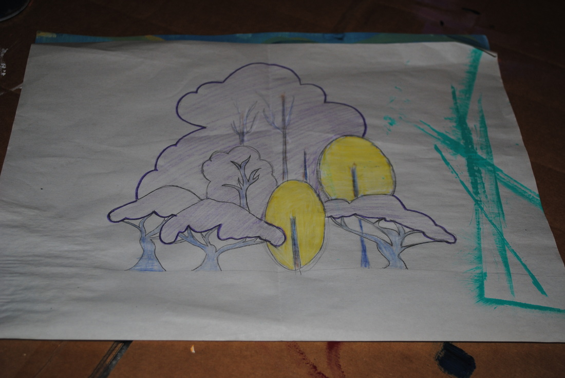
the trees below are a thousand times easier than the ones i was trying to draw before. the trunks are still difficult, but i like the fullness of the trees. I want the base of the trees to be a deep purple, the awkward trees to be bright orange, and the background to be a teal and then fade into a yellow. the contrasting colors match evyind earle's style and the trees are based off of his techniques. i think this sketch will be failry sucessful. i'm excited to finally atart painting.
trees.
these trees will be the death of me. I decided the shore scene below was not going to work out because of the trees. I attempted to do another version of the large tree, but it looked too similar. so I decided to create something completley different and mesh the two evyind earle landscapes below.
evyind earle
the newest assignment was to come up with our own creation based off of evyind earle's landscapes. we need to include depth and his basic themes and strucure. i'm thinking about doing either one of those giant tree's or a beach scene. for my begining art final i did a beach scene so i'm fairly familiar with the way he structures those paintings.
finishing touches
it took me a while to perfect the head, i had wanted it to have teeth, but everytime i added teeth it looked mean..... so eventually i settle for a toothless turtle. a little disapionting, but i'll get over it. it took a few tries, but in the end i figured out how to get the letters to fit perfectly.
doodling
this assignment has brought me some joy in history, but don't tell mr. clifford i said that. the doodle's i practiced are to small to get a picture of, but i tried sayings like "the apple doesn't fall far from the tree" and "look before you leap". However, the doodle that really worked out was "slow and steady wins the race". in art class tomorrow i'm going to work on finalizing the doodle.
Getting creative
the newest assignment I'm really excited for. we are making calligraphs, which is an image created out of words. after coming up with an image we are then going to block print it, which is essentially a stamp. this assignment invovles alot of creaticvity so i'm really excited for it.
no joke
so my criticism of this assignment may have been a little harsh...... its actually alot harder than i thought it would be. i'm discovering that some shades of red contain blue, and other weird colors to get them exact. the assignment is taking alot longer than i thought it would. i've been avoiding my yellow's because they are more hay colored and i can't even figure out were to begin when trying to mix them. the next blog will be under the painting studio, and it will come with a complete set if instructions to acheiving each color. you'll be suprised in how i got some of the colors.
intro into painting
so our intro into painting is a rather boring and childish assignent. we had to pind three sades of all of the colors, roy-g-biv, and mix colors to match them. then we will paint squares to see shich shades stand out and which ones drop into the background. this week will be tons of fun! whoop. whoop.
Charcol is messy :-(
the finished product is under pencil designs, but i've written the low-down here. charcol.gets.everywhere! this entire week my right hand and forearm have been basically black. That is because he charcol causes a light dust over top of the picture, these little clumps got everywhere. the eraser i used to fix all of these streaks was pitch black by then end of this project. However, the finished product was pretty amazing. i didn't think i was going to be able to pull off the picture, but i did. the hardest part was the bars, and trying to shade them correctly. in the end i felt successful, and i think i'd enjoy to use charcol a little more in my future art career.
practice is difficult
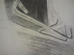
so when we do the final draft it'll be in charcol. however charcol is very difficult to work with, so before we ruined our final draft we practiced with graphite. remember, this is a rough draft, and I couldn't get the things exact. for instances the areas which are covered in large squiggles will be pitch black when I use charcol. I've also dicovered that i love erasers, because with this project even a little strike was very dark. i picked a hard picture, i hope the final product is a somewhat decent version of it.
when i do the final, i plan to change a few things: the pipes are uneven and awkward, same with the shading on those, also the table top will be grew, not white, and the underside of the table will be pitch black.
when i do the final, i plan to change a few things: the pipes are uneven and awkward, same with the shading on those, also the table top will be grew, not white, and the underside of the table will be pitch black.
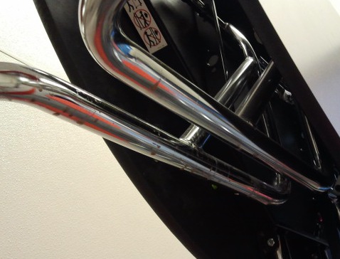
a new perspective on things
our newest assignment was to find something typical in a school and take a picture of it. The catch is that the picture had to be taken from a unique angle. i found most of the pictures I took boring and rather unoriginal, until i came upon our cafeteria tables. it's just a plain round table, but at the time it was folded up and I got to look underneath- luckily there was no gum under this one! the table had several pipes and springs and other metal objects supporting it, so i took the picture down below. It looks nothing like a table and i feel it really captures the assignment.
Practice makes perfect
It took some time to get all of the lines exactly correct. With two point perspective yo really need to be careful about what line goes to which perspective piont. that was the most difficult part for me. however in the end I got the picture to work right. My sketches all look exactly like the final, so I'm only going to upload my final. Check it out in Pencil Designs.
Hallways. Whoop. Whoop.
Today we started our hallway drawings. The only change from beigning year is that we are now drawing in two point perspective. This gives us the oppertunity to highlight a whole corner!
Finally!
I didn't really combine the two drawings, however I did dramatize my triangles and the depth which made the piece alot more sucessful. This is the sketch I used for my final, you can look at the picture under Pencil Designs!
Here goes a second try!
I'll upload the picture of this one in a few days, but tonight I left it at school. I figured I'd type up the paragraph anyways. So I started doing this wavy pattern with triangles. The triangles grew and shrunk in size along this wave, to develop depth. I don't love this design all that much. However I did stick to the assignment. Mr. Meserve came up and suggested that I combine the first drawing and the second, I'll try that tomrrow and see how it goes.
Attempts
Unfortunatley, I threw away my fisrt designs. They were really ugly in all honestly.... However I can describe them to you. I wanted to have a really large circle in the top right corner of my paper, inside the circle I wanted more circles, varying in size. The variation was supposed to develop depth and movement in multiple areas inside of the circle. Then outside of the circle I had wavy lines connecting up to the circle creating some movement. Conceptually and ideally it was going to be a cool development, however it turned out to be a disaster so I trashed the idea. I'l bring a new one to you tomorrow.
The Next Piece
The next assignment is just a slight branch off of our first assignment. Our objective is to create movement and depth through lines and shapes. This seems pretty basic and easy. However I'm kind of at a loss as of what to do. Hopefullly I will come up with an idea soon......
Refinery

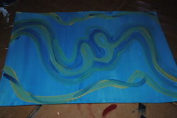
I worked on developing quite a variety of designs, however this is the one which was the most solid and interesting out of all of them. I continued to develop this race-track idea that is kind of shown in the image below. I made the race- track continue constantly throughout the piece so that the audiences eyes have a simple track to follow. For the Final product see "The Great Race" under Pencil Designs.
First Instincts

This is one example of some of my movement designs which I created. I knew from the begining I wanted to develop a desig which used both straight lines and curve lines. My ultimate goal was to use the straight lines to create depth and the curved lines to create the movement aspect. Here I used a minimal amount of curved lines, but the straight lines traveling to my perspective piont is the idea I want to continue to use. In the next design I'm going to try to use the curved lines to more of an advantage.
First Reactions
The first assignment of this year was a pretty basic one. However, the idea was still some what of a chellenging concept. We are suppossed to create space and movement through lines, and only lines. Ideally, my final product will be something fairly simple, but also intriguing to the eye. I want the movement to take the audience's eyes somewhere, rather than just fill the the paper with random lines. I'm excited for the challenge, and can't wait to see how the rest of this semester will develop. :)
